I've had this old needlecase for a few years. I actually made it myself when I was in primary school class 3 at the tender age of around 7, so 1978/9. I even remember being disappointed when I went wrong on the dark green/peach line, but it was rather a complex stitch for a tiny tot to do, no? Well, my mum used it for years and then washed it out and gave it to me when I made her a new one back in about 2005/6.
You can see how untidy it'd got inside as well. Bits of thread hanging around, flannel insert all rusted, needles all over the place in not much order, except that most of the top right section was blunts - tapestry needles.

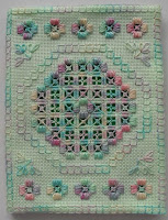
 Whilst we were in Taiwan I worked a nice new one in a hardanger design. I'd done an identical one in pink (which, OK, means it wasn't really identical.....) and gave it to my mother-in-law, and that after promising myself I was going to work that needlecase and NOT give it away. I felt sorry for her as she'd had a rough time of it just previously, so I thought I'd give her the choice of colour and have the other one myself. 5 years later and it's been made up and waiting for needles for about the past 18 months. So, last night I finally got around to populating it.
On the top left hand side we have tapestry needles in sizes 20, 22, 24, 26 and tiny 28s. Under that come crewel/embroidery needles in sizes 10, 9, 7 (which is my preferred size - not too fiddly to work with), 5 and a couple of 3s.
Moving on to the right hand side and, from the top, three beading needles, 4 straw/milliners ones in sizes 3, 5, 7 and 9, then two other large needles that I don't really know what to call, followed by chenilles in sizes 18, 20, 22 and 24, then a few general sharps for sewing.
So, now I just have to get used to the sight of my new needlecase. At least it's still green!
 I've been thinking about the berries design and the problems associated with it. First of all, the silk (backed with interfacing) feels very stiff and rather like paper. Not nice to work on. And, as I had it out of the frame for a while, there are nasty buckles in it, which just won't do. You can see a bit of how it's got spoiled here.
Also, to be honest, I'm not that pleased with the design. It's all over the place with no real sense of balance and I just can't find any enthusiasm to work it. I started on the monogram a few weeks ago but, as the letters are half the dimensions of the ones I took the design from (Susan O'Connor's book), they really are too small to do properly and, when I tried, they just looked so scrappy that I would have done better when I was seven! If not, then at least there would have been that as an excuse. So, with all that in mind and the fact that silk on silk was really not at all practical for an everyday manicure set, (I mean, we're talking about a normal, modern woman here, not Lady Mary Crawley!!), I decided to take the piece out of the frame and take the whole thing back to the drawing board. Perhaps a larger monogram with the berries around it?? I'll see what I can come up with.
In the meantime, I went through my kit box and fished these two out.
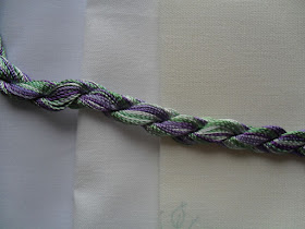
I could wish that, when kit makers were putting these things together, they'd spare some thought on how well the colours in the design go with the fabric they provide. It always seems to be a cream colour that gets used (and the piece in the Brazilian kits is rather rough and rigid as well), but it seems to me that these purple roses and the light, blue-ish greens that are with them would be much better suited to white. I laid the threads against three fabrics for comparison. The first from the left is white (cool), then an antique white (neutral) piece, then the cream (warm) from the kit. I know it doesn't show up as well as it could here (the original fabric is a bit yellower in reality), but the cool shades match the white so much better. Colour is very important to me and I can't feel comfy with 'it looks OK' when it can look better! Perfectionist? Well, perhaps. In some things anyway. A pass grade won't do for me when a distinction is available.;)
I haven't started either yet, and I also want to have a go at a berry or two, so I can't say for sure what's coming next, but something will. Soon....
© Elizabeth Braun 2011


It does look much better on the antique white!
ReplyDeleteI'm for the bright white myself, but either is better than that cream!
ReplyDeleteLove the pun in today's title!!!!
ReplyDeleteAm I missing something? What berries design?
ReplyDeleteTo tell you the truth I rather like the cream background. I generally think that bright white is so severe. My eye tends to gravitate towards the cream, which I find soothing.
Off topic ::: you mention in the header that you have 'a slight obsession with colour'.
ReplyDeleteI'm a bit colour-aware, having done medieval calligraphy and illumination, and mixing my own colours in gouache for 6 years, but I want to learn more about colour theory - specifically for embroiderers, if possible. Could you recommend any books?
Best regards
Good to see some of your early work, as well!
ReplyDeleteTht is so strange, I have just sorted out my needlecase too....
ReplyDeleteThe story of the needlecase is great! What are you going to do with it now? I just found a tie-dye pillow that I made for Home Ec in high school. In the trash :(. It's worn through and losing the stuffing, but still I want to pull it out and save the fabric.
ReplyDeleteRegarding the colors for the kits, I'd guess they get a price break by buying a lot of one color is more the reason why they seem to always be the same. But yes, I agree with the others, either of the whites are better, with the antique white having a slight edge to my eye.
First time reading your blog. Very nice!
I wish they would be a bit more generous with the thread. If you mess up and have to redo something then often the thread is spoiled.
ReplyDeleteJanice
Elizabeth,
ReplyDeleteI was wondering if the hardanger needlecase was your own pattern? Or if not, where I could get that pattern. I think it's lovely, and I'm in need of a needlecase :) Thanks!
~Sarah
Hi Sarah! I hope you come back to see this as I have no other way to contact you!=(
ReplyDeleteThe needlecase was a free download from the now defunct Classic Stitches site. That being the case, I can e-mail you my copy if you're willing to leave your e-mail addy on this or any post's comment section (I'll delete it ASAP, don't worry!). Tell me if you need full instructions, or just the pattern.