Showing posts with label Designing. Show all posts

Thursday, 12 January 2017

Autumn Leaves Wedding Pillow - Design, Transfer and First Steps

It's finally time to get going on all the un-blogged projects that I've been working over the past three or four months.  It was rather hectic for a while, but now I feel that I've more or less caught up with myself and am ready to start documenting what I can remember of the process of creating three wedding gifts, one wedding dress modesty panel, one wedding card and a 'finishing up' project where I mounted or otherwise dealt with things where the stitchery had long since been completed, but was awaiting being made into something.

Let's start with the autumn leaves wedding souvenir pillow for the younger brother of the groom who received the white rose and lavender pillow back in May.  You could say that the pillow itself was the first one's little brother too as it was a little smaller, the design was simpler and quicker to work as I was using wider gauge threads.  More on that later.

The green leaves emoji you see above and may recognise from WhatsApp et al was, basically, the commission I received back in August, along with the wedding date and a 'neutral colour' for the background.  The bridal pair are very fond of leaves, woods and that kind of thing, and they often used this emoji as their symbol during their courtship and engagement.

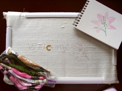
The groom's mum initially asked if I could do it just as in the emoji - all rich green, but, as you can see, there simply isn't enough detail in it to make a worthwhile embroidery of any size.  It'd be ok as something about an inch square, but it's much too stylized to be any good as a thread painting.  So, I changed it to a more autumnal mix of colours, using this image I found on-line as a bit of a guide.  I zoomed the emoji to the right size on my tablet screen and traced it off there.  (Do you know how hard it is to trace off a screen?  Never mind one that keeps altering the size and jumping around if it feels too much pressure from your pencil!!?)  I then typed the numbering using the most rustic and woody looking font I could find, printed it out and made the following working design diagram, which, unless you're very new to my blog (in which case, Hi! Welcome☺), you'll have seen a few months ago.


The '10' was just that tiny bit too high up, so I compensated a bit when tracing it off onto the light beige/cream slub silk in my usual, high-tech, no expense spared style! ☺


I chose Madeira Silks to work with this time as they're much thicker than Pipers Silk Floss and have less sheen - perfect for the more rustic look needed for leaves.  Ok, yes, much, much faster to work with than the finer ones too.  Definitely no complaints there!

Here is the initial palette of autumn leaf shades I chose to work with.  It's also quite clear in this photo why I needed to re-wash and press the light silk.  Actually, I'd forgotten, but this fabric can be awfully 'papery' to work with.  I actually threw the last piece I tried to start a project on away as it was so unlike fabric and I couldn't bear the texture.  I'd worked on enough pieces of silk to know that it shouldn't have been like that, so, suspecting an over-zealous application of something with a stiffening effect, I headed to the washbasin with my trust Ecover delicate fabric detergent and some regular laundry softener, and gave it a good rinse out - after having washed a sample of the same fabric and pen to make sure I wasn't about to mess up my tracing.


The brown fabric shown underneath the main piece is a lovely, rich, reddish brown shade that came in a theme pack from The Silk Route a few years ago.  It was great to be able to use it for a perfectly matching project as the colour is really a dark copper tone.  Gorgeous!


Next up was making a start on the stitching by working the leaf sprig stem and beginning to outline one of the leaves.

The next day, I had to go and visit my mum in hospital and picked up a yellow and dark orange leaf of a similar type to the ones I was working as a colour and shading reference.  (My well-informed-on-nature friend, Emily, helped me to identify beech leaves as a possible type.)  As you can see from the outlined first leaf below, I'd woefully missed the mark when it came to how bright the colours needed to be!  Back to the Madeira Silk thread drawer and out came some much more vibrant shades to work with.


Here's the final line-up of colours and tools that were used in this project - including the sewing cottons that were needed for the finer leaf veins and the cute chocolate cupcake pincushion that a friend made me last spring and that really came into its own during this project.


Next time: progress on the leaves!

UNLESS you'd like me to mix the projects up a bit??  I have six whole projects to blog, including the finishing up one.  Would you like to see one at a time?  A mix of two or three at a time?  Or all of them in rotation?  What do you think?  Click over from your reader software and let me know.  They've all to be done and are all complete, so any order is fine with me.  You say.....

I also have a year end summary and projects planned for the year ahead to post (as well as how the ones I've started are coming on), plus a report on how I managed to downscale some of my stash - halved my fabric, can you believe?!  So, lots coming up.  Hoping to get my blogging umph back.  It's been gone for about two years now and it would be nice to get well and truly back into it.  No promises, but I'm going to try. ♥

Text and images © Elizabeth Braun 2017

Monday, 23 May 2016

Designing and preparing to stitch a souvenir wedding pillow

If you've been following me on Instagram, you'll have seen this whole project through to completion, but, as it was a rush job, I didn't have time to blog it until now.  IG is great as a whole post can be done in just one or two minutes, although the picture quality often isn't so good and the editing features are limited.

Less yadder, more project.

An old chum is getting married down in London next weekend and I wanted to make him a little something to mark his big day.  I usually ask my friend(s) whether they would like a ring cushion, a wedding sampler sort of thing or something for their home (usually a scatter cushion cover).  I had an idea of a sort of sampler for this couple as the groom's mum had told me that they already had a ring cushion, so I asked her to run it past them.  I got a very useful design brief in return, that they'd like a wedding souvenir cushion, even if only a small one, with white roses, their initials and the date on, and could they have a sprig of lavender too?

I used the open rose and rosebud from Trish Burr's 'Long and Short Stitch Embroidery - A Collection of Flowers' and remembered that there was a lavender piece in 'The A-Z of Thread Painting'.  I traced them, scanned the tracings, resized them and printed them out along with some letters and numbers using a nice font in MS Word (here showing the 28 05 bit accidentally printed out in italic!!)  Each element was cut out and tried in various combinations in a square outline.

Then it was time to move on to colour selection.  I love this part of the process as I adore colour and getting just the right shade is important to me.  Here you can see me with my Anchor colour chart, bags of DMC stranded and a white rosebud photo on my tablet to help me adapt the pinks from the book designs to the needed white (which is to be their main wedding flower).  You can also see my new work area in this shot.


The next stage was to decide which colour was to go where on the thread painted elements, so I made some more copies of the flowers and planned out the shadings.

Following on from that was the tracing of the design onto this lovely lilac and light brown shot silk.

As you can see, I have zero fancy equipment.  Apart from the fact that I have no room to store it, I resent spending money on a specialist item when things that I already have to hand will do just as well.  I frequently use a window as a light box.  In this case, I pinned the tracing (which I'd made good and dark) to the back of the fabric, then taped the whole thing to the window so that it didn't slip during the process.  The pattern was drawn on the fabric using a 0.3mm black biro that I got in Taiwan.


Once the fabric was in the hoop and ready to start stitching, I began to feel that, not only was stranded cotton a little 'large' for the size of the design (the whole thing would be a square with 7"/22cm sides), but that I wanted more sheen.  So, the choice was clear - switch to Piper's Silks.  Each strand is about the same gauge as one of sewing cotton, so about half that of a strand of regular embroidery floss.


I have over 500 shades of stranded cotton, and only 117 of Piper's Silk, so I found my colour choices a little more limited, but, as usual, this only seemed to matter when it came to greens and neutrals.  Funny how other colours can seem to substitute for near shades quite well, but greens, browns and greys always have to be right.  I have 50% again as many greens as most other shades, but still had to make do somewhat.  I nearly ordered some more, but remembered my crafts No Buy in time!!!  I'd also have had to buy more storage for them, which wouldn't have been good.  I also could foresee a saving in stitching time as there's only one 'white' in Piper's, but two in Anchor!!

Next post on this project will show the working of the lavender and the rose greenery.  Hope you like the look of this piece so far! =)

Text and images © Elizabeth Braun 2016

Saturday, 21 June 2014

Wedding Ring Cushion/Pillow Design Process

Today I want to share with you the first stages of the wedding ring cushion.  I've been working on and thinking about the design on and off ever since I was first told that the couple wanted a ring cushion instead of the usual something for their home.  I played around with some CQ style ideas, like the cushion I'd done years ago, but when I saw this design, I felt it was the right basis.

Fans of Helen M Stevens will recognise this as one of her pieces.  In fact, it's the second of the masterclass lesson pieces from 'Helen M Stevens' Embroidered Flowers' and these first two photos are taken directly from that book.

I couldn't use it as it is, as there's no room for the rings to sit, unless I was to hang them off one of the leaves, but that's a bit far out for my tastes!!  So, I needed to simplify it a bit and the first step was to get a photo of the outline in the book.

I then pasted the image into a Word document three times, each one a different size so that I could decide on the right scaling.  Here you can see print outs at an image width of 6"/15cm, about 5"/12cm and then at 4"/10cm.  It turned out that the middle sized one was the best fit for the size of square I plan to work in.

I wanted to keep both types of flower - evening primrose and herb robert, in the piece, so I needed to pull the central section down and eliminate the right hand evening primrose.  I also needed to pull the left hand flower back a bit in order to leave a good sized empty space in the centre of the design for the rings to sit in.

I placed some tracing paper over the middle sized print out and began to trace the elements I wanted to keep, moving the tracing paper round each time I needed something at a different angle.

I also added in some small herb robert flowers on the left hand side to make sure that the piece was balanced colour and content wise.

Why two tracings here?  The top one is the original one that I took from the book design and then transferred to a sketch pad (see below).  By the time it'd got this far, some of the leaf and small flower shapes had become a bit distorted, so I tidied up the outlines, added in the colours etc and generally finalised the design before taking a careful new tracing ready to transfer to the smooth, white piece of silk I have ready.


Above is the finished design, (although I may well be adding a stumpwork brimstone or other yellow type of butterfly in the top right hand corner), and below are the threads I've chosen resting on the white silk.  As you can see, I've invested in some DMC threads at long last!  The reason behind this is that, even if you have the whole of a stranded cotton collection, you simply can never have enough greens!


About ten years ago, another stitcher told me that she never liked mixing Anchor and DMC threads as they had a different sheen and I must say that, from comparing them in the skein, she's right!  It's not a huge difference and, in one strand work, probably won't show, but as the DMC shades are the shinier, I'm tempted to get the corresponding DMC yellow as that's the largest single colour area and would look good a bit shinier.  I'll make a final decision on that later when I see how some of the other colours are shaping up together.  After all, Trish Burr mixes them on occasion without issue, so I'll see how I feel about it anon.

Any experience and/or opinions on this one?

Text and images © Elizabeth Braun 2014

Tuesday, 9 February 2010

Re-designing a goldwork kit

This afternoon and evening (in 2 sessions), I made a start on the Benton & Johnson Goldwork String Instrument kit that I'd brought with me. I remember buying this one as part of a real retail therapy session - serious comfort shopping - during the time I was horribly unhappy doing my old teaching job, along with several others. I spent as much at that one stitching show as I would normally do at two or three - a whole year's worth!!

This is the original design of the kit, although the one I bought came with black silk as a background fabric, which is what I wanted.

Anyone who knows much about modern string instruments would see at a glance that this design is far from accurate and, whilst I'm no expert player (yet!!!LOL), I do actually own a viola and so I always intended brushing this design up a bit. Well, a lot actually!! I know it's meant to be a generic sort of stringed instrument, but I wanted my own instrument represented in goldwork, so it needed a chinrest for a start. The body shape also needed refining and the pegs needed to match the strings - 4 strings (very badly placed strings at that) and 6 pegs, since when?? Recently, via the Pin Tangle blog, I came across a blog posting by Kirsty on the 'Feeling Stitchy' team on how to turn a photo into an embroidery outline and so I followed that wonderfully simple and effective process as follows.

Find the photo you want to stitch from. This is one I found via Google images of a viola, complete with chinrest (some are pictured without, some folk even play without one, but I'm not up for that!).

Using Photoshop Elements' 'Filter' tab, select the 'Sketch' type and then pick the one that best suits your needs from the list given. The tutorial I read said 'Pencil Sketch', but my version doesn't have that, but the 'Photocopy' option worked beautifully and, after increasing the contrast to make the outlines really stand out, I was left with this image:

Print it out at the relevant size, take a tracing from it and transfer the design to your background fabric in your preferred way (mine is good old dressmaker's carbon paper in white for dark backgrounds, although yellow would have been good too), the results of which you can see below.

That's it, ready for stitching and not needing to go to all the fuss of drawing it out myself.=) This really is a good method, try it and see for yourself some time.

To my delight, I found that I'd actually brought some of my goldwork threads with me - 3 colours of Bright Check (chips) and a thing of Twist, as well as the Kreinik Japans and other Kreinik cord type metallics, so I can adapt the threads and actual working of the design as well. Haven't got that far yet, will work up a stitching plan tomorrow, but the design is on the silk, which is tacked to the backing fabric ready to go in the hoop for working.=)

Sometimes kits provide the needed inspiration and materials and you can do the rest yourself. Oh, if anyone knows how to get the strong packing crease out of the middle of the fabric, please let me know ASAP!

Last night I added yet more eye candy to my blog sidebar in the shape of some of the 2007 finishes. Putting them all on would have meant that it was ridiculously long, so I dropped some of the cards and monograms. In time, I'll merge all the three years' worth of finishes into a single 'Gallery' bar, but not until I've got something to show for this year. The needlecase isn't considered a finish proper until it's made up. Many, many thanks to Margaret of NZ for kindly offering to send me the needed doctor's flannel (which I didn't see anything like whilst out at the fabric market last Friday), and also to Nic for offering to send more novels. If the postage hadn't made me feel uncomfy, I would have accepted this last offer too, but I just wanted to publically thank you wonderfully kind and generous ladies.=) Mwah! xxx

Editted to add in credits for the transformation method, Friday 11:43 am

Friday, 16 November 2007

New design as promised

Remembered to get a photo of it today! It's the initial plan, complete with notes, for a leaving card for our team's manager who's also legging it soon to a very fancy sounding job up in Durham. The above is called 'Branches of Your Life' and, although a lot of it isn't quite clear here, it's going to have characters from the various languages we teach interlinked and hanging from some branches. The others have stuff on that remind us of him - mostly sporty things, the fact that he's known for losing stuff left, right and centre, (even managed to lose his bike once, although I dread to think how he managed that!), and some 'roots' things - i.e. the Cornish bird and crown for where he was born and the Leeds Uni logo and Yorkshire Rose for where he's been for the last 8 or so years. I ordered the necessary jumbo sized card blank from Impressive Crafts, who make the most expensive, but nicest card blanks. We're going for the sky blue one. I'm hoping to make a start on the Uni logo and the octagonal door plate soon as they need to be worked separately, then attached. It's going to be a challenging (although not too badly), but enjoyable project.=)


Moira, you asked where I got my Elizabethan Embroidery books. The first two I got from the Viking Loom stand at the October stitching show I went to, but this link takes you (hopefully!) to their on-line catalogue. The other two I ordered from the New Stitches Stitch Direct site. Each book is £12.95. Don't look on Amazon as the sellers there are asking STUPID prices. I even e-mailed one and asked him if he was serious in wanting £200+ for a £13 book!! The thing is though, that I understand they've recently been re-printed, so they're not as hard to get hold of now. At stitch shows, many of the specialist book sellers who have stands there sell them too. I bought mine on the strength of the stitched models that Viking Loom (a fascinating stitchery shop in York) had on display. If you drooled over the photos, you would be positively swooning over the 'real things'! I'll be asking them for some thread suggestions for the thicker metallics when I'm at the Harrogate Halls show next Thursday.

Monday, 13 March 2006

"Welcome"!

Here's the latest design:


I swiped a lily photo from a gardening site, inverted and turned it, then did a copy as a working diagram to stitch from. The lettering is done in goldwork and is quite hard with 3 lots of thread each time, plus I never realised Pearl Purl can't be taken to the back of the work, so you have this end kinda stuck there... The idea is to get this one all stitched up by next Sunday, so I can show it to some chums then and take it for framing on Monday sometime. White or rose pink mount and antique pine frame, perhaps? Well, we'll see. Let's get it stitched first!!!!!=)

Just took delivery of a copy of 'Embroidered Bags and Purses' which I bought mostly to help me be able to put my lil' sis's purse together. I'll design it myself, but there are some lovely ideas in there. Whimper!
Also hoping to get both the needlecases sewn up this week so they can be delivered to the relevant friends' mum's. Aiming for Sunday with that one too. Watch this space.....
Oh Terri, you asked how I was going to finish the 'Poppies and Mallow' design. The short answer is, 'I'm not!' I'm going to put it in a tube and let the lady it's for decide on her own frame once she gets it. I haven't even found a suitable to tube to send it in yet as our local PO is out of them and there are no used ones at work either. I might go ferretting around a few other departmental offices on Wednesday and see what I can find there.

Monday, 25 July 2005

The Life-Cycle of a Stumpwork Strawberry!

I've just completed my 89th piece of needlework - a card featuring stumpwork strawberries with some goldwork bits too. Here's how it was done:

This is the design process:

See a picture that inspires you in an embroidery magazine, but that you think could be improved upon.... Cut pieces of the rough shape and colour out of an unused mail-order catalogue, then play with positioning them on a piece of paper, drawing in the stems and an other extras with a biro. Then, take a drawing from that rough 'cut-out' mosaic. Colour in in the approximate colours you want to use.

Here are the materials: Anchor stranded cottons, #12 pearl cotton for the needlelace strawberries, #8 for the strawberry leaves, Anchor Ophir in gold for the strawberry pips, some bright check (gold chips), for the flower centre and some Needle Necessities Overdyed Kreinik #8 braid to be couched on for the stems.
The strawberries are first padded with two layers of red felt, then corded buttonhole stitch worked over that to produce a raise and textured effect. One done in close-up here:

Next came the silk shaded leaves done in three shades of warm green stranded cotton. (Not so many photos taken of further stages now.....) Now onto the flower. This was worked in white and pale yellow, again silk shaded according to the Royal School of Needlework tecnique - outline in split stitch, then work from the outside of the shape in in stitches of varying lengths, each layer over-lapping the previous one to some degree. The flower has gold chips as a centre!

Over-dyed Kreinik #8 braid was then couched on, which put some sparkle into otherwise rather dull stems. It was couched on with Kreinik blending filament in shade #015 so as to blend in as well as possible. Finally, after sinking and securing the ends of the couched braid, the tiny strawberry leaves were worked in two shades of #8 pearl cotton.

Here's the back of the completed work for curiosity's sake!!!


And the front once mounted into the card blank:

 
Google+